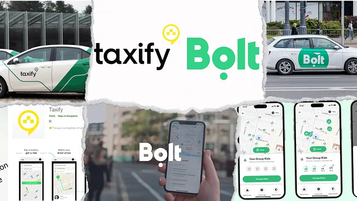
Not too long ago, millions of commuters across Europe and Africa would open an app and say, “Let me Taxify.” Much like “Googling” or “Ubering,” Taxify had become a verb, synonymous with getting a quick, affordable ride. Today, however, we no longer Taxify — we Bolt. It’s the same app on your phone, offering the same services and often the same drivers. But there is one key difference — the brand evolved. The shift has been so profound that most people have even forgotten that Bolt was once known as Taxify.
This subtle change in name, from Taxify to Bolt, might seem like a simple rebranding exercise. Yet, it speaks volumes about the power of branding and what it means for a company to realign its vision with its identity. What happened to Taxify, and why did we stop “Taxifying” and start “Bolting”? Let’s take a journey back to understand how the brand was born, grew, and eventually outgrew its name.
When the Name Fit Like a Glove: The Birth of Taxify:
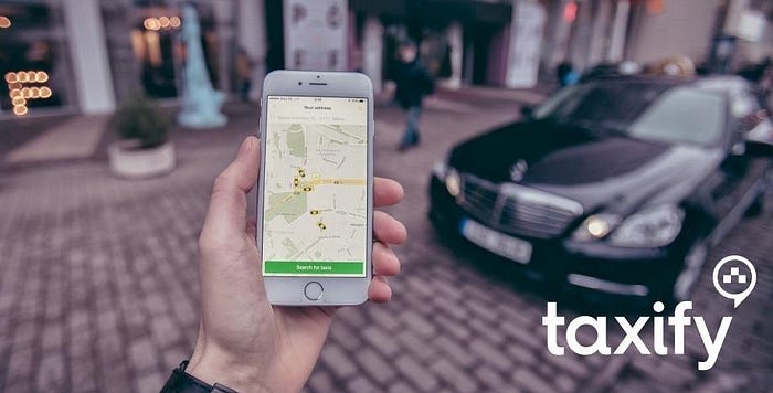
In 2013, a 19-year-old Markus Villig launched Taxify from his home in Estonia. His goal was simple: to offer a ride-hailing solution that could rival giants like Uber and Lyft, but with a twist — lower commissions for drivers and cheaper fares for passengers. It was a classic startup success story, driven by a clear and compelling name: Taxify.
At the time, Taxify made perfect sense as a brand name. It was:
- Clear and Purposeful: The word “taxi” immediately made it clear what the app did — it helped people find taxis or private drivers easily. The “-ify” suffix, much like in “Spotify” or “Notify,” gave the name a tech-savvy, modern feel, aligning with its image as a disruptive force in the traditional taxi industry.
- Memorable: It was easy to say, simple to recall, and distinct enough to stand out in a growing sea of ride-hailing apps. Phonetic appeal plays a huge role in branding, and Taxify was crafted with this in mind.
- Globally Resonant: Despite being based in Estonia, the name traveled well. It was universal enough to be understood in various languages, giving it a strong foothold for international expansion.
However, as Taxify grew, the very name that contributed to its early success became a limiting factor.
When the Name No Longer Fits: Taxify’s Growing Pains

By 2019, Taxify had expanded into more than 30 countries across Europe and Africa, offering not just ride-hailing services, but also electric scooters and exploring food delivery. The company was evolving rapidly, but its name remained tied to a single type of service — taxis.
This disconnect between what the company was becoming and what its name suggested posed a branding challenge. Taxify was no longer just a taxi-hailing app, but the name limited its ability to communicate its full range of services.
Taxify experienced what we call a brand elasticity problem — when a brand name no longer stretches to encompass the company’s growing or changing business model. For Taxify, the issues were clear:
- Narrow Perception: The word “taxi” restricted the brand’s identity to ride-hailing, even though the company was diversifying into scooters, bikes, and food delivery.
- Confusion in New Markets: As Taxify expanded into markets where taxis weren’t the dominant mode of transportation, or where they were illegal (as in parts of Europe), the name created unnecessary barriers. In micro-mobility sectors like scooters and bikes, the name Taxify felt out of place.
Markus Villig and his team recognized that the name no longer reflected the company’s aspirations. It was time for a change. And so, they made the bold decision to rebrand.

Bolt: Rebranding for the Future of Mobility
In March 2019, Taxify became Bolt, and with that change came a new identity — one that reflected the company’s broader vision and ambition to be more than just a ride-hailing service.
Why the Name Bolt?
The Meaning Behind the Rebranding: Bolt’s Vision for the Future
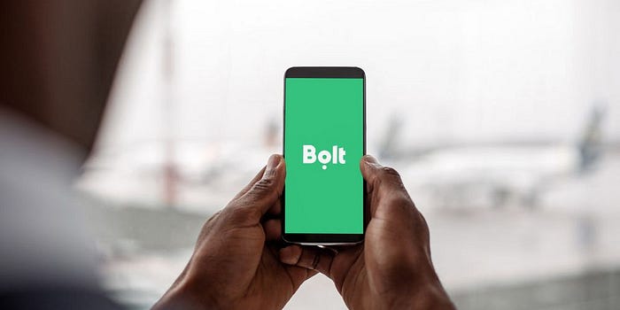
In an interview shortly after the rebranding, Markus Villig explained, “We realized the name Taxify was too restrictive. We’re about transportation in all its forms, not just cars.” The rebranding was more than just a name change — it was a signal to the market that Bolt was more than a taxi app; it had transformed into a full-fledged mobility platform.
The decision to rebrand as Bolt was carefully calculated. The new name needed to reflect everything that Taxify had become and where it was headed. While Taxify had been a verb for hailing a taxi, Bolt suggested something broader, more dynamic, and future-facing. Here’s what the new name brought:
- Speed and Energy: The word “Bolt” conveys speed, agility, and power. Much like a bolt of lightning, it suggests quick, efficient movement — a perfect metaphor for a service that swiftly gets people from point A to point B.
- Electric Mobility: Lightning is also a powerful symbol of electricity, aligning with Bolt’s focus on green, electric mobility solutions like electric scooters. The name reflected the company’s commitment to sustainability and a clean energy future.
- Versatility: Unlike “Taxify,” the name Bolt doesn’t confine the company to a single mode of transportation. Whether you’re hailing a car, riding a scooter, or ordering food, the name Bolt fits across all forms of urban mobility.
Bolt’s New Vision, Values, and Expansion
Rebranding wasn’t just about changing the name. Bolt’s vision had evolved, and so had its core values. The company was now focused on providing affordable, sustainable mobility for urban dwellers. Its new values reflected this shift:
- Green Mobility: Bolt prioritized electric scooters and vehicles as part of a broader strategy to reduce emissions and promote sustainable urban transport solutions.
- Affordability: The company remained committed to keeping prices low for both riders and drivers. Bolt positioned itself as a more affordable alternative to competitors like Uber, with lower commission rates for drivers.
- Multi-modal Transport: Bolt expanded its services to offer multiple forms of mobility — from ride-hailing to scooters and food delivery — positioning itself as a comprehensive mobility solution rather than a single-service app.
The Impact of Rebranding: From Consumers to Revenue

Consumer Perception: Embracing the Change
When a brand as large as Taxify rebrands, there’s always a risk that consumers won’t accept the new identity. However, Bolt’s rebranding was smooth and largely well-received. This success can be attributed to several key factors:
- Clear Communication: Bolt made a concerted effort to communicate the reasons behind the rebrand to its user base. They emphasized that, although the name was changing, the service that consumers loved — affordable, reliable rides — would remain the same.
- Modern, Forward-Looking Image: The new name and branding helped position Bolt as a modern, innovative company focused on sustainability. Consumers, especially younger ones, embraced the company’s green mobility initiatives, appealing to eco-conscious riders.
- Versatility: By shedding the “taxi” label, Bolt expanded its appeal to a broader audience — those who might use scooters, bikes, or food delivery services but didn’t necessarily identify with traditional taxi rides.
Bolt’s rebranding also offered a fresh start in new markets, enabling the company to step out of Uber’s shadow. In many Eastern European and African cities, Bolt became synonymous with local, affordable mobility, positioning itself as a strong competitor to Uber.
Internal Strategy: Aaker’s and Kapferer’s Branding Theories at Play
From a branding theory perspective, Bolt’s rebranding reflects key principles from Aaker’s Brand Equity Model and Kapferer’s Brand Identity Prism:
Aaker’s Brand Equity Model:
- Brand Loyalty: By continuing to offer affordable fares and driver-friendly commissions, Bolt reinforced its brand loyalty. Despite the name change, the core service proposition remained intact, ensuring strong customer retention.
- Perceived Quality: The rebranding elevated Bolt’s perceived quality by aligning the brand with sustainability, speed, and innovation. The focus on green mobility strengthened the brand’s reputation for being forward-thinking.
- Brand Associations: The transition from Taxify to Bolt reshaped customer associations. Bolt is no longer linked exclusively with taxis; instead, it is now associated with multi-modal transportation and eco-friendly mobility solutions.
Kapferer’s Brand Identity Prism:
- Personality: The new name gave Bolt a more dynamic, greener, and innovative personality. The lightning bolt symbol reinforced its focus on speed, energy, and modernity.
- Self-Image and Reflection: Bolt appealed to consumers who see themselves as part of the sustainability movement. It invited users to not just travel through cities, but to do so in an eco-friendly and efficient manner, aligning with the values of environmentally-conscious riders.
Impact on Revenue and Growth
While specific revenue figures are hard to pin down, the rebranding clearly had a positive impact on Bolt’s overall growth:
Market Expansion: The rebrand enabled Bolt to enter new markets where taxis were not the dominant form of transport. The name “Bolt” fit well with scooter sharing, bike rentals, and other urban mobility solutions.
Increased Market Share: Bolt saw significant growth in Eastern Europe and Africa, often outpacing Uber in market share due to its cheaper fares and lower driver commissions. Bolt’s expansion into scooters and food delivery diversified its revenue streams, giving it new sources of income beyond ride-hailing.
Funding and Investment: Investors responded positively to Bolt’s rebranding, seeing the company’s ability to adapt and evolve as a key strength. Bolt raised $713 million in 2021, reflecting investor confidence in its multi-modal mobility strategy.
Successful Rebranding: Dunkin’ (Formerly Dunkin’ Donuts)
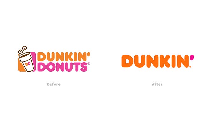
Dunkin’ provides a prime example of a successful rebranding. In 2018, Dunkin’ Donuts officially dropped the “Donuts” from its name to focus on beverages, which had become its primary revenue driver. Much like Bolt, Dunkin’ wanted a broader identity, signaling to consumers that they offered more than just donuts. This rebrand allowed Dunkin’ to stay relevant, expand its menu offerings, and modernize its image. As a result, Dunkin’ has remained a strong competitor in the fast food and coffee industries, reinforcing the idea that rebranding, when done right, can reflect a company’s evolution and attract new customers.
Apple (From Apple Computer to Apple Inc.)
In 2007, Apple dropped “Computer” from its name to signify its transition from being solely a computer manufacturer to a broader consumer electronics and services company. The rebranding coincided with the launch of the iPhone, which marked Apple’s expansion into mobile phones, wearables, and entertainment services. This move helped Apple become a dominant player in a variety of industries beyond computing, reflecting a brand that could encompass products like the iPod, iPhone, Apple Watch, and Apple TV.
Lesson: Apple’s rebranding demonstrates how a company can shift focus from a specific product to a broader lifestyle brand, communicating growth and diversification.
Instagram (Logo Change in 2016)
Instagram’s switch from a skeuomorphic camera icon to a more minimalist, abstract logo was met with initial criticism but ultimately strengthened the brand’s modern, streamlined appeal. The new logo better reflected Instagram’s evolution from a simple photo-sharing app to a social media platform that includes Stories, video content, and e-commerce functionality. Despite the initial backlash, the redesign has aged well, making Instagram’s visual identity more adaptable for different contexts (e.g., app icons, merchandise).
Lesson: Instagram’s rebranding shows that even when initial consumer response is negative, a well-timed and visually forward-looking change can support a brand’s growth into new functionalities and areas.
Unsuccessful Rebranding: Gap’s Short-Lived Logo Change
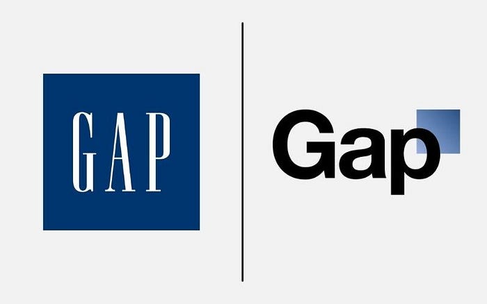
Not all rebranding efforts end well. In 2010, Gap unveiled a new logo, ditching its iconic blue square for a sleeker, more modern design. The backlash was immediate and overwhelming, with customers criticizing the new logo as bland and uninspired. Gap eventually reverted to its original logo just six days later. This failed attempt shows that while a company might feel it needs to modernize its brand, rebranding without considering customer attachment to the existing identity can backfire spectacularly.
Pepsi’s Logo Redesign (2008)
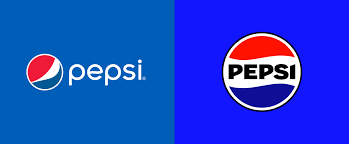
Pepsi spent $1 million on redesigning its logo in 2008, introducing a minimalistic design that aimed to align with a more modern aesthetic. However, the rebranding was met with confusion because the new logo was seen as too similar to its previous iterations. Additionally, the brand was criticized for spending such a large amount without a significant visual change. The redesign also lacked the impact Pepsi hoped for in terms of rejuvenating the brand.
Lesson: Rebranding needs to have a clear purpose and deliver a significant impact, especially if substantial costs are involved. Consumers may not respond positively if the changes feel unnecessary or lack a compelling story.
The Royal Mail to Consignia (2001)
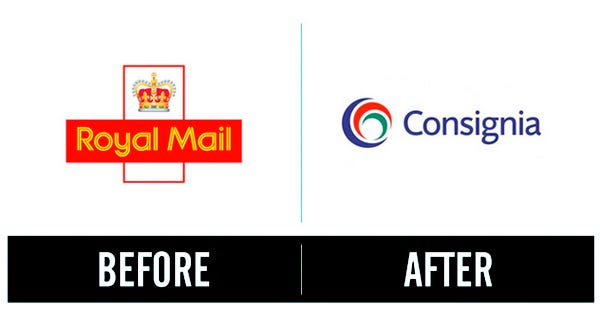
In an effort to modernize its image and reflect a wider range of services, the UK’s Royal Mail rebranded as “Consignia” in 2001. The name change was universally criticized for being vague and lacking connection to the brand’s heritage. Customers didn’t understand what “Consignia” meant or represented. After just a year and millions of pounds in losses, the company reverted back to Royal Mail.
Lesson: Sometimes, rebranding can fail if the new name is too abstract or disconnected from the core identity, particularly when it involves a well-established, trusted brand with long-standing consumer loyalty.
Conclusion: Branding Reflects the Present, Rebranding Reflects the Future
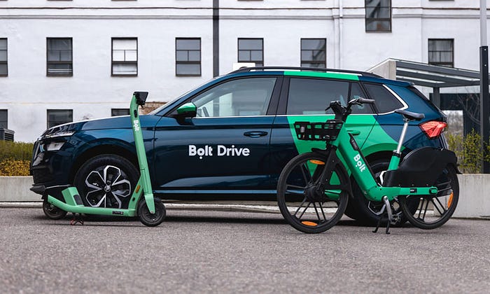
So, what’s in a name? A name like Taxify served its purpose when the company was focused on ride-hailing. But as the company’s vision expanded, so too did its identity. The transition from Taxify to Bolt wasn’t just about switching names — it was about realigning the company’s mission and values with its aspirations for the future.
The lesson is clear: branding doesn’t just reflect what a company does today. It’s also a tool to shape where the company is headed. And in Bolt’s case, rebranding was the key to unlocking its potential as a leader in green, affordable, and versatile urban mobility.
As we bolt through cities today, it’s worth remembering that we once taxified — and that’s the strength of branding, well, rebranding.